
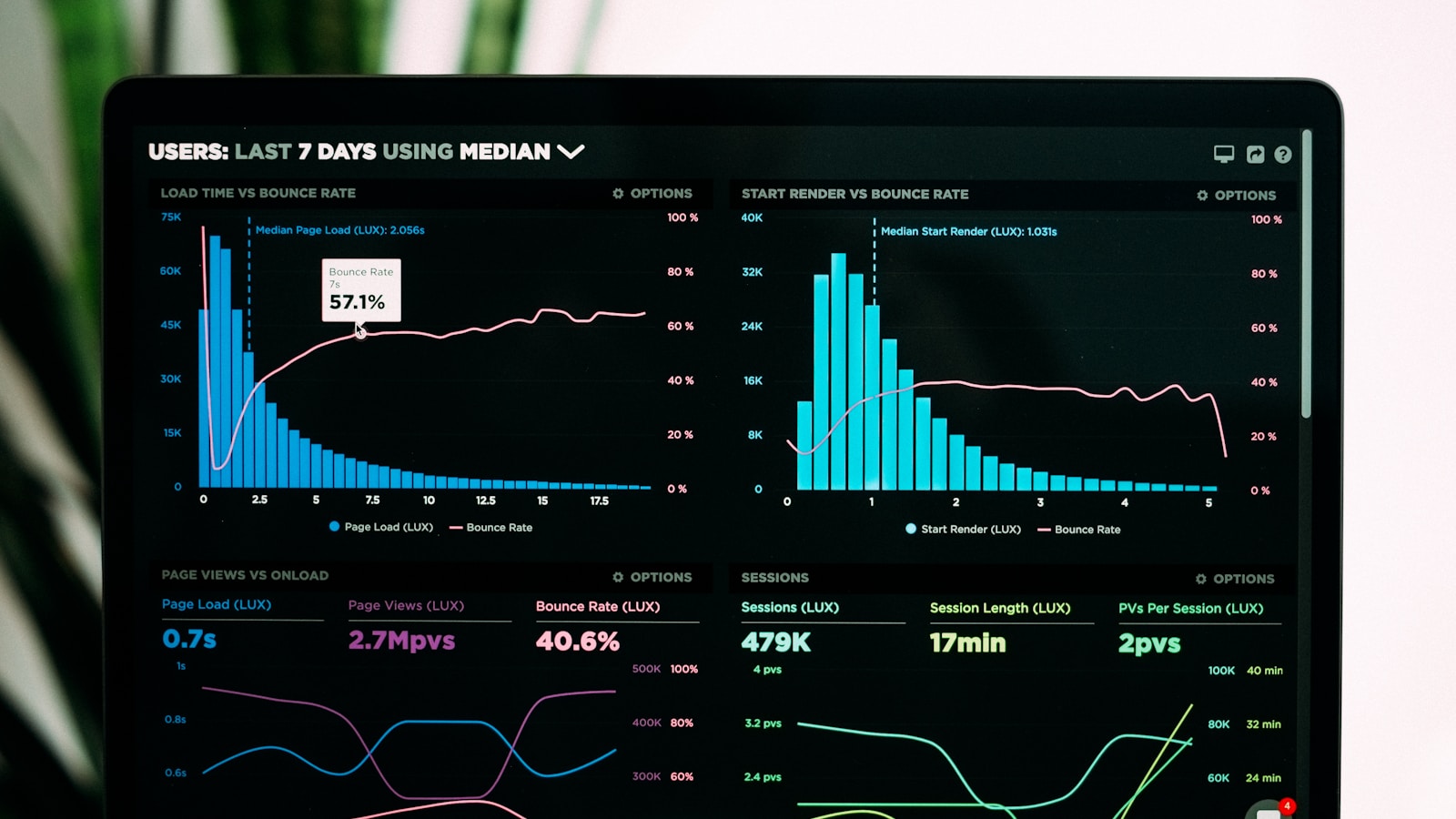
As the software industry decisively pivots from rigid per-seat subscriptions toward consumption-based pricing (driven by AI token generation, cloud compute, API requests, and data pipeline throughput), the billing dashboard has become the most emotionally charged surface in B2B SaaS. When a customer opens their billing tab, they are not looking for passive accounting ledgers—they are looking for reassurance that their software bill will not surprise them with an unexpected $10,000 overage.
Poorly designed billing interfaces breed anxiety. When usage meters are delayed by 24 hours, overage thresholds trigger without advance warning, and proration line items resemble cryptographic puzzles, customer sentiment collapses into distrust and churn. Designing high-retention usage-based billing UX requires real-time telemetry visualizers, proactive threshold guardrails, and transparent proration math.
- The “Zero Surprise” Golden Rule: The primary KPI of a usage billing dashboard is the elimination of bill shock. If a user receives an end-of-month invoice higher than expected without receiving automated alerts, the UX has fundamentally failed.
- Dynamic Progress Meters with Velocity Projections: Static progress bars showing current usage (e.g. “64% of credits used”) are insufficient. Modern dashboards pair consumption gauges with an estimated run-rate projection that forecasts exact end-of-cycle totals based on current velocity.
- Granular Hard and Soft Budget Caps: Allow administrators to configure soft alerts (email/Slack notification at 80% and 95%) alongside optional hard caps (throttling or auto-pausing non-critical jobs to prevent runaway cloud charges).
- Interactive Proration Sliders: When users adjust tier limits, seat counts, or credit add-on packs, an interactive visualizer must calculate and display real-time proration amounts down to the cent before checkout confirmation.
The Anatomy of a Modern Consumption Dashboard
An enterprise-grade usage dashboard (modeled after best-in-class implementations at OpenAI, PostHog, Snowflake, and Vercel) structures consumption telemetry into four distinct ergonomic layers:
| Billing Surface Layer | Core Metric Displayed | Visual Design Pattern | Psychological Impact on User |
|---|---|---|---|
| 1. Hero Consumption Gauge | Active monthly quota vs. consumed units (tokens, GBs, events, credits). | Stacked horizontal progress bar with color thresholds: Indigo (<75%), Amber (75%–90%), Crimson (>90%). | Instant status awareness within 3 seconds of page load. |
| 2. Projected Velocity Run-Rate | Forecasted total cost at current daily consumption rate. | Dotted projection line on a 30-day time-series bar chart showing historical vs. predicted usage. | Eliminates budget ambiguity; prompts proactive upgrades before overage penalties hit. |
| 3. Per-Unit Dimension Breakdown | Breakdown by environment, API key, project, or department. | Faceted data table with sorting, percent contribution badges, and CSV export. | Allows team leads to identify runaway scripts or rogue microservices instantly. |
| 4. Threshold & Guardrail Controls | Notification webhooks, auto-recharge triggers, and spending limits. | Inline currency inputs with toggle switches and Slack/Email destination selectors. | Transfers complete financial control back to the customer. |
Designing High-Converting Overage and Threshold Alerts
When an account approaches 100% of its monthly quota, how the system communicates that boundary directly impacts conversion versus cancellation. In traditional SaaS, hitting an overage triggered an aggressive red modal blocking access—a practice that infuriates enterprise users during critical production incidents.
Modern product-led architectures utilize a Three-Tier Progressive Escalation Framework:
- Informational Threshold (75%–80% Quota): A subtle dismissible banner appears inside the billing tab and main dashboard: “You’ve consumed 80% of your included credits. At current run rates, you’ll reach your plan limit on September 24. [Review Add-Ons]”. No workflow interruption.
- High-Intent Warning (90%–95% Quota): Direct notification sent via configured channels (Slack, Webhook, Email to Billing Owner). The interface displays an action modal offering seamless 1-click plan upgrades or enabling Auto-Recharge Packs without leaving the editor. Review our conversion patterns in The Freemium-to-Paid Paywall UX Playbook.
- Soft Landing at 100%: Instead of hard-locking customer data, enterprise SaaS grants a grace window (e.g. 48 hours or a 5% soft overage buffer) while displaying a persistent banner. If auto-recharge is enabled, the balance replenishes transparently; if not, non-critical background jobs pause gracefully while core read-only access remains intact.
The Math of Proration: Building Transparent Visualizers
Mid-cycle subscription adjustments are notoriously opaque. When a user upgrades from a $50/month tier to a $200/month tier 18 days into a 30-day billing period, they are faced with confusing credit line items, remaining balance deductions, and partial-month charges.
To eliminate checkout friction—leveraging the micro-interaction principles established in Why Stripe’s Checkout Converts at 94%—the upgrade modal must feature an Interactive Proration Visualizer:
| Proration Line Item | Mathematical Formula | Example Calculation (18 Days Remaining) |
|---|---|---|
| Unused Previous Plan Credit | -(Current Tier Monthly Cost × (Days Remaining / Total Days)) |
-$50.00 × (18 / 30) = -$30.00 (Credit applied) |
| New Plan Charge (Prorated) | +(New Tier Monthly Cost × (Days Remaining / Total Days)) |
+$200.00 × (18 / 30) = +$120.00 (Charge) |
| Net Due Today | New Plan Charge − Unused Plan Credit |
$90.00 (Billed to primary card immediately) |
| Next Billing Date Renewal | Standard recurring full price on scheduled renewal date. | $200.00/month recurring starting on 1st of next month. |
When presenting these options, aligning with high-converting SaaS pricing table UX patterns guarantees that users clearly understand what features and quotas are unlocked at each increment.
Stripe Customer Portal vs. Custom In-App Billing UI
Engineering teams frequently grapple with whether to outsource their billing view to the pre-built Stripe Customer Portal or invest 4–6 weeks of engineering into a bespoke, in-app billing dashboard.
The optimal enterprise architecture in 2026 is a Hybrid Implementation:
- Keep in App: Usage meters, credit gauges, run-rate forecasts, overage alert settings, and proration preview modals must reside natively within your application’s design system so users never leave their workflow context.
- Delegate to Stripe Portal: Deep-link out to the Stripe Customer Portal strictly for sensitive, PCI-compliant payment method updates, adding secondary backup credit cards, and downloading historical PDF tax receipts.
People Also Ask
What is the best way to visualize credit consumption in SaaS?
The most effective pattern is a stacked horizontal progress meter combined with a 30-day velocity run-rate projection. This visually demonstrates not only how many credits have been consumed to date, but the exact date the customer is forecasted to exhaust their quota based on daily usage trends.
How do you prevent bill shock in usage-based SaaS?
Implement automated threshold alerts (via email and Slack webhooks) at 75%, 90%, and 100% of plan quotas. Allow administrators to set optional hard spending limits, and provide a 48-hour soft grace period before throttling services when limits are reached.
Should B2B SaaS build custom billing UI or use Stripe Customer Portal?
A hybrid approach is recommended: build custom, in-app UI for real-time usage meters, velocity charts, and plan comparison modals to maintain brand immersion, while offloading payment method updates and PDF invoice downloads to the secure Stripe Customer Portal.