
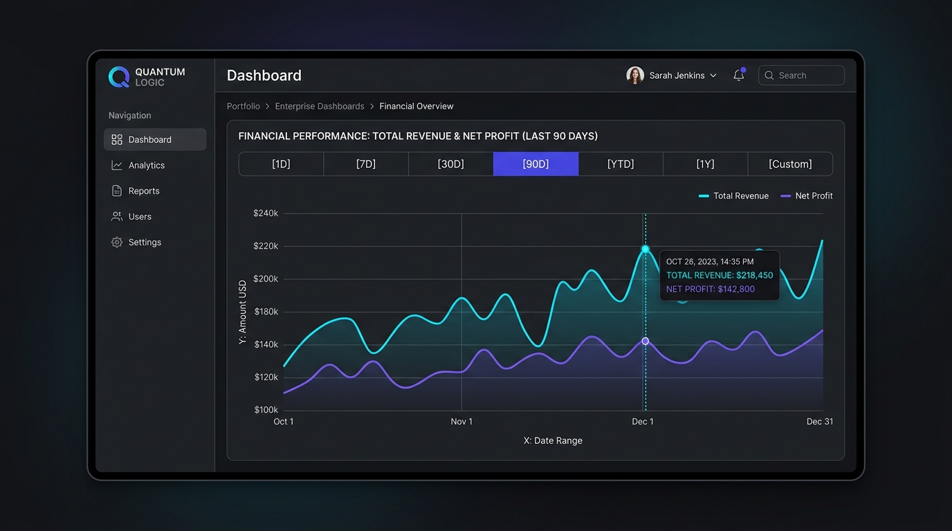
Data visualization is the visual engine of modern B2B SaaS applications, yet it remains one of the most poorly implemented interface domains. In production analytics dashboards, users routinely encounter flickering hover tooltips that clip against viewport edges, deceptive truncated Y-axes that exaggerate normal variance, and monochromatic color palettes that completely fail accessibility audits for colorblind professionals. Designing high-density, interactive time-series visualizations in 2026 demands strict interaction physics, accessible dual-encoding palettes, and intelligent crosshair scrubbing that turns complex datasets into instantaneous operational insight.
- Crosshair Snapping Over Direct Hover: Never require users to hover their cursor over a tiny 4px data node. Implement a vertical crosshair scrubber that tracks X-axis mouse coordinates anywhere within the chart canvas and snaps to the nearest timestamp.
- The Zero-Baseline Rule: Bar and column charts must always start at a zero baseline to maintain accurate volumetric proportions. Line charts tracking small relative deviations (e.g., server latency or exchange rates) may utilize dynamic bounding baselines, provided explicit delta labels and scale warnings are present.
- Non-Color Visual Encoding: Under WCAG 2.2 AA, color must never be the sole differentiator between metrics. Differentiate multiple time-series curves using varied line treatments (solid, dashed, dotted) and distinct geometric vertex markers (circles, diamonds, squares).
B2B SaaS Chart Architecture & Interaction Matrix
Selecting the correct visualization primitive depends on dataset density, interaction requirements, and rendering performance:
| Visualization Type | Primary Architectural Role | Recommended Rendering Tech | WCAG Accessibility Complexity | Mobile Ergonomic Rating |
|---|---|---|---|---|
| Time-Series Line Chart | Continuous operational trends & metrics | SVG (Recharts / Visx) | Low (Clean semantic tags & table fallbacks) | High (Horizontal scrub panning) |
| High-Density Scatter Plot | Outlier detection & correlation clusters | HTML5 Canvas / WebGL | High (Requires offscreen DOM table) | Poor (Requires tabular fallback) |
| Segmented Stacked Bar | Composition & proportional share analysis | SVG | Moderate (Requires accessible segment keys) | Moderate (Requires vertical stacking) |
| Micro-Sparklines (Table Embedded) | Row-level contextual trend indicators | Inline SVG Paths | Low (Labelled via aria-label summary) | Exceptional (Scales with fluid rows) |
Crosshair Scrubber Physics & Viewport-Aware Tooltips
The most irritating micro-interaction in dashboard analytics occurs when a user tries to hover over an individual data point, only for the tooltip to oscillate frantically between mouse states or render off-screen beyond the browser edge. In enterprise data systems, pairing graphs with virtualized tabular views creates cohesive analytics workflows; explore our architectural guide on Designing High-Volume Data Tables in 2026.
To deliver rock-solid scrubber ergonomics:
- Continuous X-Axis Interpolation: Attach the pointer listener to the entire chart bounding box (
<rect class="overlay" width="100%" height="100%" />). Calculate the closest timestamp index using a binary search (e.g.,d3.bisector), snapping a 1px vertical guideline to the exact X coordinate. - Collision-Aware Tooltip Positioning: Tooltips must automatically flip alignment. If the crosshair is on the rightmost 25% of the chart, the tooltip flips to the left of the guide line. If the crosshair is near the top edge, the tooltip drops downward to prevent vertical viewport clipping.
- Multi-Series Metric Aggregation: Never render multiple independent tooltips for separate lines. Consolidate all active series into a single, unified floating card that displays timestamps, series color chips, exact metric values, and period-over-period percentage variances.
The Zero-Baseline Heuristics: Honesty vs. Utility
One of the fiercest debates in data visualization concerns whether the Y-axis must always start at zero. The answer depends strictly on geometry:
1. Bar & Column Charts (Absolute Zero Mandatory)
In bar charts, visual weight is judged by the length and area of the bar. If a bar representing $100,000 starts at a $90,000 baseline, a $105,000 value appears three times larger than $100,000—a severe visual distortion that destroys user trust.
2. Line Charts (Context-Dependent Dynamic Range)
In line charts, users are assessing rate of change and slope rather than absolute area. For instance, when monitoring database query latency fluctuating between 18ms and 24ms, forcing a zero baseline flattens the line into an indistinguishable flat horizontal bar, concealing critical latency spikes. When using dynamic baselines:
- Provide clear, explicit Y-axis grid tick labels.
- Add a subtle broken-axis icon (
≈) near the baseline origin to visually signal the truncation.
Accessible Palettes & Non-Color Data Encoding
Designing charts solely with subtle pastel colors or red/green status flags creates catastrophic barriers for the 8% of male users with color vision deficiency (deuteranopia and protanopia). For a comprehensive breakdown of theme contrast and dark mode tokens, read our blueprint on Dark Mode Color Architecture in Modern SaaS.
Follow the Three Pillars of Chart Accessibility:
- High Contrast Against Canvas: All series strokes must maintain a minimum 3:1 contrast ratio against the chart background, and tooltip text must meet 4.5:1.
- Secondary Stroke Encoding: Never rely on color alone. Format primary series as solid 2.5px lines, comparison benchmarks as 1.5px dashed strokes (
stroke-dasharray: 4, 4), and projected estimates as dotted lines (stroke-dasharray: 2, 2). - Direct Legend Association: Instead of placing a generic floating legend box across the screen, place metric labels directly at the terminus of each line where possible, reducing cognitive scanning saccades.
Responsive Degradation & Screen Reader Tables
A multi-series chart that looks magnificent on a 27-inch 4K studio display will degenerate into an unreadable tangle of overlapping lines on an iPhone screen. To maintain mobile usability:
- Adaptive Time Presets: Automatically collapse segmented range controls (e.g., from
[1D] [7D] [30D] [90D] [YTD] [1Y]to a compact native select dropdown). - Single-Series Scrubbing: On viewports below 640px, default the view to the primary metric and provide a toggle pill for secondary comparison curves.
- The Semantic Table Fallback: Every chart element should be accompanied by a visually hidden, screen-reader-accessible HTML
<table>element (or a toggleable “View as Table” control) that allows keyboard users and assistive devices to traverse data points chronologically.
For usage-based billing interfaces where customer trust is tied to granular visual metrics, explore our design framework in Usage-Based Billing & Credit Meter UX Architecture.
Principal Analyst’s Verdict
The best analytics interfaces don’t show off gratuitous 3D effects or decorative gradients; they eliminate ambiguity and deliver instant comprehension. In 2026, building enterprise-grade charts requires embracing rigorous interaction fundamentals: crosshairs that snap without jitter, unified multi-series tooltips that stay inside viewport bounds, and colorblind-safe dual encoding.
Always respect geometric integrity. Never truncate bar chart baselines, use secondary stroke dashes to assist color-impaired users, and embed an accessible semantic data table beneath every mission-critical visualization.
Where to Expand Your Analytics Architecture Next
Continue mastering data-dense interfaces and enterprise SaaS design systems with our specialized blueprints:
- High-Volume Tabular Systems: Build scalable, virtualized data tables in our Enterprise Data Table Architecture Guide.
- Dark Mode Color Contrast: Ensure accessible contrast ratios across charting palettes with The Dark Mode Color Architecture Playbook.
- Billing & Meter Visualizers: Design transparent consumption charts in our Usage-Based Billing UX Teardown.
People Also Ask
Should the Y-axis of a line chart always start at zero?
No. While bar charts must strictly begin at zero to preserve accurate volumetric proportions, line charts represent slope and rate of change. For metrics with narrow variance (such as server latency fluctuating between 20ms and 25ms, or body temperature), starting at zero flattens the line and conceals critical fluctuations. When using a truncated baseline, clearly label the axis ticks and add a visual broken-axis indicator.
How do I make SaaS charts accessible for colorblind users?
To comply with WCAG 2.2 AA standards, never rely on color as the sole visual differentiator between data series. Use secondary encoding such as distinct stroke patterns (solid, dashed, dotted), geometric shape markers on data points (circles, squares, triangles), and ensure a minimum 3:1 contrast ratio against the background.
What is a crosshair scrubber in data visualization?
A crosshair scrubber is an interaction pattern where a vertical guideline tracks the user’s cursor along the horizontal X-axis anywhere on the chart, automatically snapping to the nearest timestamp. This eliminates the frustration of requiring users to precisely hover over microscopic data points and enables continuous, frictionless data exploration.
SVG vs Canvas: Which is better for B2B SaaS dashboard charts?
For standard time-series charts with under 1,000 data points, SVG (using libraries like Recharts or Visx) is preferred because it renders crisp vector lines at any DPI and supports native DOM accessibility elements. For extreme high-density visualizations (such as financial tick charts with 50,000+ points), HTML5 Canvas or WebGL is required to maintain 60 FPS rendering performance.