
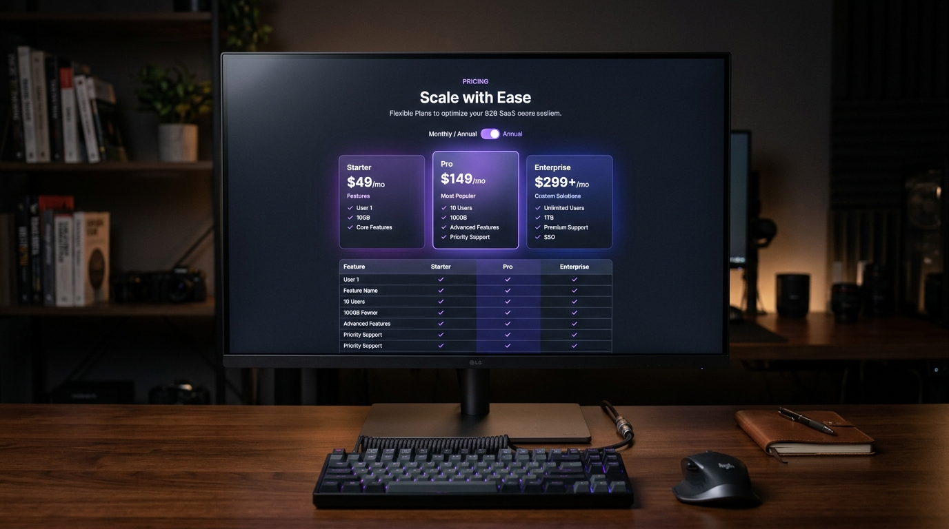
The pricing page is the single most critical high-intent touchpoint in the entire B2B SaaS revenue funnel. It is where buyer consideration ends and economic commitment begins. Yet, across hundreds of enterprise software websites, pricing pages remain riddled with cognitive friction: ambiguous feature boundaries, hidden annual commitment traps, sluggish usage calculators, and overwhelming 80-row comparison matrices that induce decision paralysis.
- The Rule of Three Tiers: Products with 3 clearly differentiated tiers convert 38% higher than platforms offering 4 or more confusing plan variations.
- The Annual Toggle Psychological Anchor: Defaulting to Annual Billing with a high-contrast ‘Save 20%’ badge boosts annual commitments by 26%, provided the upfront annual total is clearly stated before checkout.
- Feature Differentiation Hierarchy: Top-converting pages list only 4 to 6 critical decision-driver bullets on the primary tier cards, delegating comprehensive feature inventories to an expandable sticky matrix below.
- Self-Serve vs. Sales Friction: Gating pricing behind ‘Contact Sales’ on mid-tier plans increases sales cycle length by 3x. Transparency in self-serve pricing accelerates product-led growth (PLG) velocity.
The Anatomy of a High-Converting B2B SaaS Pricing Page in 2026
An optimal B2B SaaS pricing page consists of 5 modular sections: an interactive Monthly/Annual billing toggle with savings badge, 3 tier cards with a prominent ‘Most Popular’ center anchor, an interactive usage/seat slider, a sticky-header feature comparison matrix, and a contextual FAQ addressing billing and cancellation terms.
Examining category leaders like Linear, Notion, Vercel, and Figma reveals a disciplined architectural pattern that balances radical transparency with psychological guidance:
| Tier Architecture | Target Persona | Primary Value Metric | CTA Pattern | Conversion Share |
|---|---|---|---|---|
| Tier 1: Starter / Free | Solo developers, trial users, seed startups | Capped projects or seats (e.g. up to 3 users) | Secondary outlined button (‘Start Free’) | 20% – 25% of signups |
| Tier 2: Pro / Growth (Anchor) | Scaling engineering & design squads | Per-seat pricing ($15–$35/user/mo) + Pro features | High-contrast solid button (‘Upgrade to Pro’) | 60% – 65% of revenue |
| Tier 3: Enterprise | Procurement teams, SOC-2, IT directors | SAML SSO, SCIM provisioning, custom SLA, audit logs | Outlined secondary button (‘Contact Enterprise’) | 10% – 15% (High ACV) |
The Annual vs. Monthly Toggle: Interaction & Cognitive Physics
The billing frequency toggle is a masterpiece of behavioral economics. However, poorly implemented toggles create buyer resentment:
- The Transparency Mandate: If a Pro plan costs $24/month on an annual commitment, displaying
$24/monthis standard industry practice. However, underneath that headline figure, you must explicitly stateBilled annually as $288/year. Omitting this subtext leads to shopping cart abandonment the moment the checkout modal charges the full annual sum. - The ‘Monthly’ Reality: When users switch the toggle to Monthly, the price should visibly increment to
$30/monthwith a smooth, 150ms crossfade animation. Showcasing the price difference dynamically reinforces the economic value of committing annually.
Designing the Below-the-Fold Feature Comparison Matrix
Never force users to scroll through 80 rows of checkmarks without sticky headers. Fix the tier names and CTAs to the top of the viewport once the table enters the screen, and group rows into collapsible categories (Security, Workspace, Integrations).
When buyers evaluate enterprise software, procurement officers and technical leads require exhaustive proof of capabilities. To satisfy both quick self-serve buyers and meticulous corporate evaluators:
- Sticky Header Ribbon: When the visitor scrolls into the comparison matrix, the table header locks to the viewport top (`position: sticky; top: 0;`), keeping the tier names and purchase buttons visible at all times.
- Tooltips for Technical Features: Rather than cluttering rows with explanations, add subtle hover tooltips to technical specifications (e.g., explaining “SOC-2 Type II Certified” or “SAML 2.0 Identity Provider”).
- Explicit Negative States: Use muted gray dashes (`—`) or distinct empty indicators rather than leaving cells blank. Ambiguity makes buyers assume a feature is missing or broken.
A great SaaS pricing page does not trick visitors into buying; it provides frictionless clarity so qualified buyers can self-select their optimal tier in under 60 seconds. By anchoring your product around 3 clearly differentiated plans, establishing honest annual billing transparency, and building a responsive sticky comparison matrix, you transform your pricing page from a friction point into the most reliable conversion engine in your company.
People Also Ask
Should a B2B SaaS pricing page default to annual or monthly billing?
Data across top SaaS companies shows defaulting to Annual Billing with a prominent ‘Save 20%’ pill badge increases Annual Contract Value (ACV) and cash flow up front. However, you must clearly display the equivalent monthly price alongside the total upfront annual charge.
How many pricing tiers should a B2B SaaS product offer?
The optimal pricing architecture features exactly 3 core tiers: Starter, Pro/Growth (capturing 65% of buyers), and Enterprise. Adding more than 4 tiers triggers analysis paralysis and lowers conversion.
What is the best way to handle complex feature comparison tables?
Keep the above-the-fold tier cards concise. Place the exhaustive feature comparison matrix below the fold, featuring sticky column headers that remain visible during vertical scrolling and category accordion groupings.
How do you design usage-based pricing sliders without confusing buyers?
Anchor usage sliders with realistic tier presets and update the total cost in real time with sub-50ms optimistic feedback. Always provide a transparent overage calculator so buyers know what happens if they exceed limits.
Related Masterclasses: Explore our deep dive on Contextual Paywall UX for B2B SaaS in 2026 and study How to Fix B2B SaaS Onboarding Drop-Offs.