
Open almost any enterprise software product in 2026 and you are assaulted by sensory noise: sparkling purple “Ask AI” buttons pulsing in every corner, floating contextual assistants offering unsolicited advice, gamified streak badges, and notification badges competing for your visual cortex. In the race to demonstrate generative AI capabilities, the software industry accidentally created the most cognitively exhausting digital environment in the history of personal computing.
As BuiltUX has articulated across design leadership analyses on the rise of ambient UX and invisible interfaces, moving beyond sterile flat design, and leading product teams with high craft accountability, the next great frontier of competitive advantage is not adding more AI features — it is designing for cognitive restoration, emotional calm, and radical visual restraint.
1. What Is Emotional Minimalism? (Beyond Aesthetic Stripping)
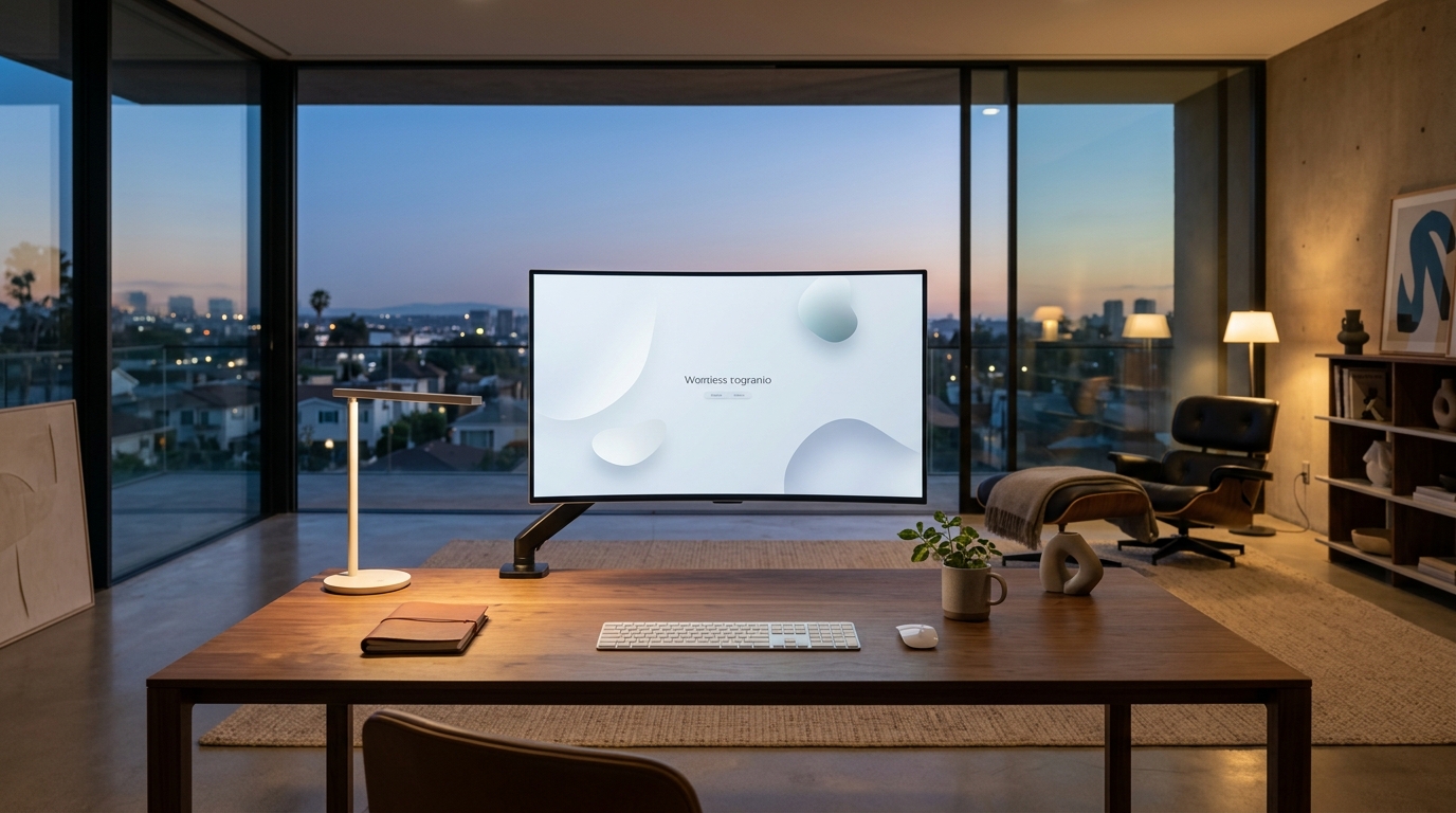
Emotional minimalism is not the austere, cold white-box minimalism of 2015 that stripped away affordances and made buttons impossible to identify. It is an intentional design philosophy grounded in cognitive psychology:
- Generous Negative Space as a Structural Sanctuary: Whitespace is not empty space — it is cognitive breathing room that allows the user’s attention to settle without tension.
- Subdued, Earth-Grounded Palettes: Moving away from hyper-saturated neon synthetics toward warm neutrals, stone tones, deep charcoals, and natural timber undertones that reduce retinal fatigue during extended screen sessions.
- Ambient, Non-Coercive Affordances: AI capabilities exist as quiet background agents that surface information only when relevant, rather than loud modal interruptions demanding interaction.
2. Cognitive Architecture: Sensory-Overload UX vs. Emotional Minimalism
Interaction Paradigm: Noise-Driven Software vs. Emotional Minimalism (2026)
| UX Dimension | Noise-Driven Feature Bloat (2024–2026) | Emotional Minimalism Paradigm |
|---|---|---|
| AI Surface Presence | Pulsing sparkle buttons, persistent floating chatbots | Quiet inline enhancements; active only upon invocation |
| Information Density | High-density dashboards with 20+ simultaneous widgets | Progressive disclosure; primary task in deep focus |
| Motion & Transitions | Aggressive spring physics, looping badge animations | Subtle natural easing (150–200ms); zero decorative loops |
| Typography Hierarchy | 7 font weights, uppercase tracking, badge pills everywhere | 2 refined optical weights, serene line-heights (1.6x) |
| User Emotion Post-Session | Cognitive exhaustion, sensory fatigue | Clarity, focused accomplishment, quiet confidence |
3. The Business Case: Why Calm Software Retains Users
In a market where every SaaS competitor has access to the same LLM APIs and component libraries, product differentiation at the feature level has compressed to zero. The products winning long-term retention in 2026 (such as Linear, Cron/Notion Calendar, and Craft) share a common attribute: **using them feels like stepping into a quiet room.** When work is chaotic, users intuitively gravitate toward software that lowers their cortisol rather than raising it.
People Also Ask
What is emotional minimalism in UX design?
Emotional minimalism is a design philosophy that prioritizes cognitive calm, generous whitespace, natural colour palettes, and non-coercive AI interactions to reduce sensory overload and digital fatigue in modern software.
Why is calm design important in 2026?
Because users are overwhelmed by aggressive AI popups, excessive notification badges, and dense interfaces. Products designed with calm, restorative principles achieve higher user retention and customer loyalty.
How do you design calm technology?
By implementing progressive disclosure to hide secondary complexity, using subdued earth-toned color palettes, eliminating looping decorative animations, and making AI features quiet and contextual rather than persistent and demanding.
