
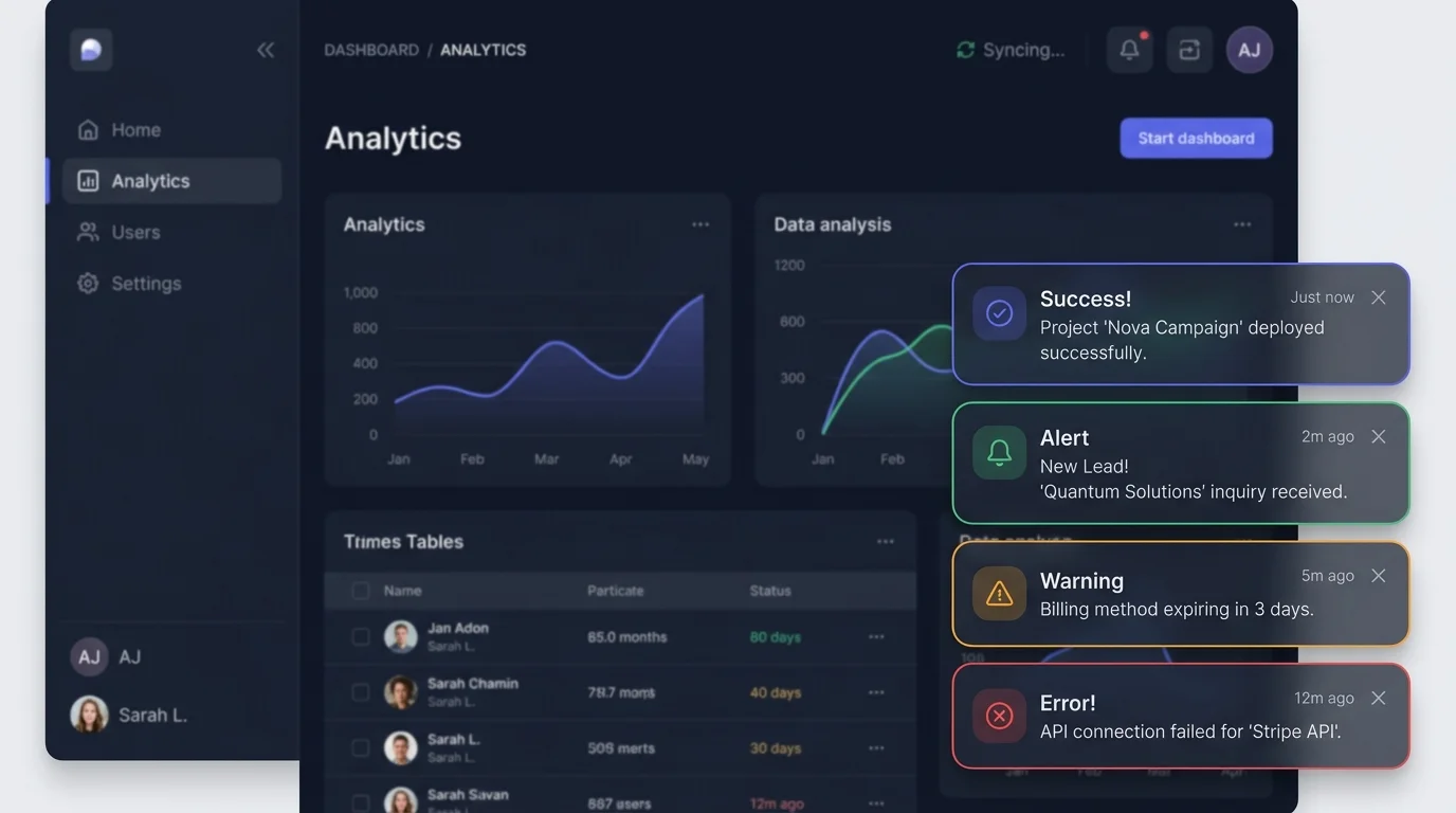
What is the Proper Duration for Auto-Dismissing Toast Notifications?
One of the most pervasive anti-patterns in modern web applications is the aggressive 3-second auto-dismissing toast. Users with cognitive impairments, motor disabilities, or those reading on mobile screens frequently miss transient notifications before their eyes can locate and parse the message. Under WCAG 2.2 Success Criterion 2.2.1 (Timing Adjustable), users must be granted sufficient control to read and interact with content.
Furthermore, when building interfaces with high mutation frequency, such as tokenized design system managers or data grid batch editors, stacking dozens of rapid-fire toasts creates visual chaos. A robust toast architecture enforces a strict maximum stack limit of three visible notifications, collapsing older notifications into an expandable history drawer.
How to Make Toast Notifications Fully Accessible (WCAG & ARIA)
A common engineering mistake is setting role="alert" on every transient message. This forces screen readers to immediately interrupt their current speech output to read banal confirmations like “Draft saved.” Routine confirmations belong in an aria-live="polite" region, allowing the screen reader to finish its current sentence before announcing the notification.
| Notification Type | ARIA Attribute | Auto-Dismiss Rule | User Interaction |
|---|---|---|---|
| Success / Info | aria-live=”polite” | Auto-dismiss: 4–6s | Optional close ‘X’ |
| Warning / Caution | aria-live=”polite” | Auto-dismiss: 8–10s | Explicit dismiss required |
| Critical Error | role=”alert” / assertive | NEVER auto-dismiss | Manual acknowledgment & action |
| Actionable Undo | aria-live=”polite” | Auto-dismiss: 8–12s (pauses on hover) | Inline button / keyboard hotkey |
Toast Placement: Top-Right vs. Bottom-Right vs. Bottom-Center
When positioning toast stacks, ensure they do not obscure critical user interface elements like modal triggers, primary action buttons, or bottom navigation tabs. Implementing a pause-on-hover and pause-on-focus event listener is essential: as soon as a user hovers their cursor over a toast or tabs into it with a keyboard, the countdown timer must halt immediately.
For engineering teams designing high-reliability user experiences, combining toast feedback with robust ambient status indicators ensures your platform communicates operational state without overwhelming the user’s attention envelope.
People Also Ask
Should toast notifications have an undo button?
Yes. For non-destructive reversible actions like archiving an email or removing a row from a table, an inline “Undo” button inside a toast provides a high-confidence safety net that eliminates cumbersome confirmation modals.
What is the difference between a toast, a snackbar, and a banner?
Toasts are transient notifications that appear over content and usually auto-dismiss. Snackbars are similar but often contain an action button at the bottom of mobile screens. Banners are persistent, full-width alerts integrated directly into the page layout that require explicit dismissal.
Do screen readers focus on toasts automatically?
No, and they should not. Forcing keyboard focus directly into a newly mounted toast disrupts the user’s current workflow. Instead, ARIA live regions announce the message audibly while keyboard focus remains undisturbed.
Before finalizing asynchronous form feedback banners, examine our forensic teardown of Form Validation UX: Inline vs. On-Blur Design Guide.