
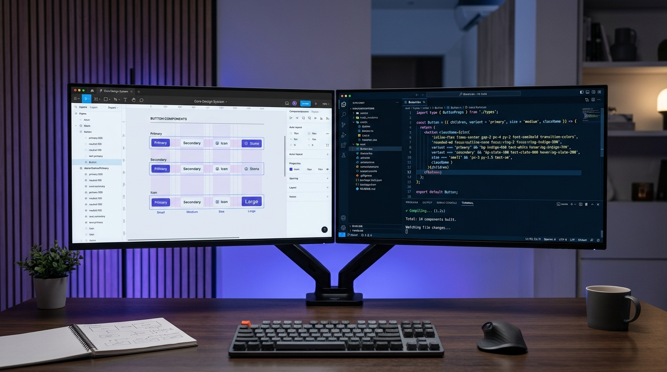
For years, the collaboration between UI designers and frontend software engineers was plagued by a frustrating reality: a designer would craft a pixel-perfect mockup in Figma, hand it off to engineering, and receive a deployed staging build that looked noticeably distorted. Spacing was inconsistent, buttons overflowed on mobile viewports, and color values drifted into a chaotic mess of arbitrary hex codes. In 2026, the introduction of Figma Variables, deep Auto-Layout updates, and code-native AST synchronization pipelines has made this friction obsolete. Achieving a zero-drift Figma-to-React workflow is no longer an elusive design fantasy—it is a standardized engineering discipline.
How Do You Translate Figma Auto-Layout Directly into Production React and Tailwind CSS?
flex-direction, Gap to CSS gap, and Padding to padding. Hug Contents translates to w-fit or flex-none, while Fill Container maps to flex-1 or w-full. By constructing Figma frames strictly using nested Auto-Layout structures rather than unconstrained canvas frames, exported React component trees achieve fluid responsiveness with zero manual redlining.
When designers model components using pure Flexbox mental models inside Figma, frontend developers can inspect the layout and immediately recognize the exact Tailwind utility classes required to implement the interface.
| Figma Auto-Layout Property | Native CSS Flexbox Spec | Tailwind CSS Utility Class | Handoff Implementation Pitfall |
|---|---|---|---|
| Vertical Layout | display: flex; flex-direction: column; |
flex flex-col |
Forgetting w-full on child containers |
| Horizontal Layout (Wrap) | display: flex; flex-wrap: wrap; |
flex flex-wrap |
Using fixed heights that clip wrapped elements |
| Item Spacing (Gap) | gap: 16px; (or var(--space-4)) |
gap-4 |
Applying legacy margin-right on children |
| Fill Container (Width) | flex: 1 1 0%; min-width: 0; |
flex-1 min-w-0 |
Text truncation breaking without min-w-0 |
| Hug Contents | width: fit-content; flex: 0 0 auto; |
w-fit flex-none |
Over-specifying fixed pixel width bounds |
Why Does Absolute Positioning in Figma Destroy Developer Code Generation?
top: 24px; left: 112px;), it cannot reflow when translated into different languages, cannot adapt to responsive breakpoints, and causes content collisions when parent cards expand. Absolute positioning should strictly be reserved for non-flowing accents: notification badge dots, floating card close buttons, and status indicator pings.
Designers must treat Auto-Layout nesting as the primary layout engine: wrapping content in horizontal and vertical stacks ensures that every element participates in predictable DOM reflow.
Configuring Figma Semantic Variables to Sync with CSS Custom Properties and Tokens
Modern design systems do not pass raw hex codes or static pixel measurements across the handoff boundary. In 2026, leading teams configure three-tier variable architectures in Figma that sync bidirectionally with code:
- Tier 1: Global Primitives: Raw palette definitions (e.g.,
slate-900: #0f172a,indigo-600: #4f46e5,space-4: 16px). These values are never referenced directly in production UI mockups. - Tier 2: Semantic Design Tokens: Intent-based aliases that adapt to modes (e.g.,
surface-primary,text-secondary,interactive-accent). In light mode,surface-primarymaps to white; in dark mode, it resolves toslate-950. - Tier 3: Component-Scoped Tokens: Dedicated bindings for complex components (e.g.,
button-primary-bg,table-header-border), preventing accidental visual regressions when global tokens are modified.
Automating the Design-to-Code Pipeline: From Component Spec to Verified Pull Request
To eliminate manual developer transcription, enterprise DesignOps teams connect Figma directly to GitHub using automated webhook pipelines:
- Figma REST API & Variables Export: When a design systems designer publishes a token collection update, a webhook invokes a GitHub Action that pulls the latest JSON variable definitions.
- Style Dictionary Compilation: The pipeline runs Style Dictionary to transform the JSON tokens into CSS Custom Properties (
tokens.css), Tailwind config overrides (tailwind.config.ts), and iOS/Android assets. - Automated Pull Request Generation: An automated PR is created in the frontend repository, complete with visual Storybook regression tests showing the exact before-and-after impact on existing UI components.