
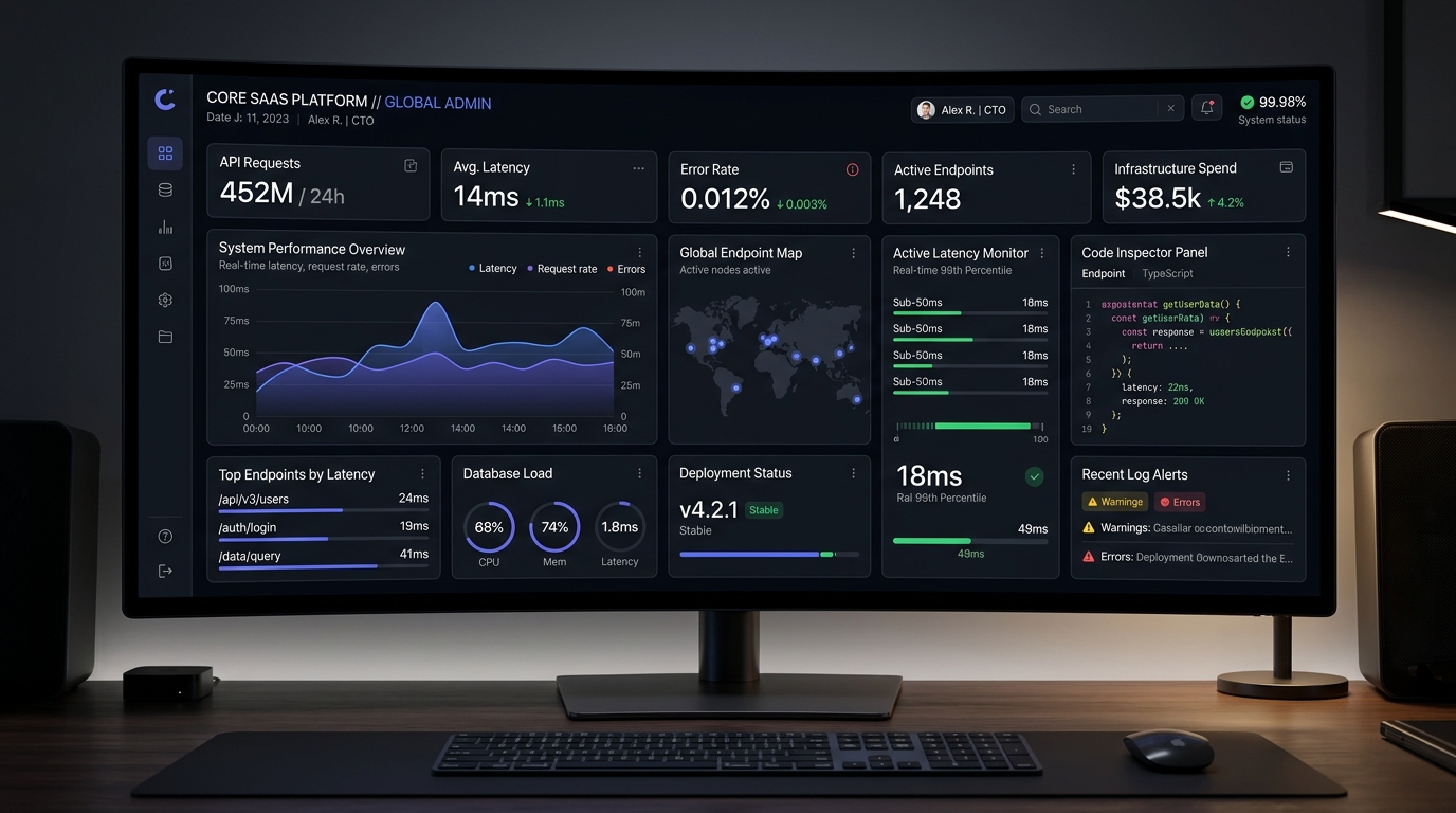
For more than a decade, enterprise B2B dashboards were synonymous with sluggish, cluttered portals: crowded navigation sidebars, multi-second page reloads, pagination controls that broke user focus, and gaudy pie charts that provided zero actionable utility. However, following the meteoric rise of developer-first power tools like Vercel, Linear, and Supabase, customer expectations have permanently shifted. In 2026, enterprise engineers, cloud architects, and product leaders demand software that operates at the speed of thought. Modern B2B SaaS dashboard UI is no longer about decorative data visualization—it is an exercise in extreme information density, sub-50ms optimistic latency, and keyboard-first spatial ergonomics.
What Makes a High-Performance B2B SaaS Developer Dashboard UI in 2026?
When an engineer inspects a deployment pipeline, debugs an API traffic spike, or revokes a compromised production secret, every millisecond of interface latency and navigational friction translates into operational risk.
| Architecture Dimension | Legacy Enterprise Dashboard (Datadog/SAP) | Developer-First SaaS (Vercel/Linear 2026) | Ergonomic Advantage |
|---|---|---|---|
| Perceived Interaction Latency | 350ms – 1,200ms (Full server round-trip) | Sub-50ms (Optimistic UI & local cache) | Feels native and instantaneous |
| Navigation Paradigm | Nested left-rail menus & breadcrumbs | Global Command Bar (Cmd+K) & Tab cycling | Hands stay on keyboard |
| Data Table Display | Paginated rows (10 per page) with spinners | Virtualized 60fps infinite scroll with sticky headers | Zero pagination friction |
| Detail Inspection Flow | Full page reload navigate to separate URL | Contextual slide-over drawer / split pane peek | Preserves filter & scroll context |
| Visual Theming | Harsh white themes; forced browser scaling | Specular dark mode (OKLCH slate & 1px borders) | Eliminates eye strain during deep work |
How Do Leading Developer Platforms Achieve Sub-50ms Perceived Latency?
Coupled with Server-Sent Events (SSE) or lightweight WebSocket feeds for live log streaming, developers monitor high-frequency telemetry without experiencing the stuttering and layout recalculations typical of polling architectures.
Designing Information Density: How to Avoid Cognitive Clutter in Tabular Data
In developer software, empty white space is not luxury; it is wasted vertical real estate. High-density design requires precise typographic and structural discipline:
- Monospace Alignment for Technical Data: Commit hashes, IP addresses, latency numbers, and timestamp columns must utilize tabular monospace fonts (such as JetBrains Mono or Geist Mono) with right-alignment, allowing the human eye to scan variances down columns effortlessly.
- Contextual Action Menus (Hover & Focus Reveal): Rather than cluttering every table row with visible “Delete”, “Edit”, and “Copy” buttons, expose primary action triggers on row hover or keyboard focus, preserving visual tranquility during scanning.
- Slide-Over Drawer Architecture: When a user clicks a log entry or server node, open a right-side slide-over drawer (using polymorphic bottom-sheet patterns on mobile). This allows deep inspection while maintaining full visibility into surrounding log events.
Dark-Mode Ergonomics: Contrast Ratios, Specular Borders & Reducing Eye Fatigue
Poorly engineered dark mode interfaces are often worse than light themes, relying on harsh, pure black (#000000) backgrounds that cause severe halation and eye fatigue. Senior design systems engineers build dark mode using layered neutral depth:
- Layered Slate Surfaces: Establish a 3-tier elevation hierarchy using deep charcoal neutrals: Base canvas (
#0b0f19), Card surface (#111827), and Floating modal (#1f2937). - 1px Specular Border Definition: In dark environments, drop shadows become invisible. Replace heavy shadows with subtle, translucent borders (
border: 1px solid rgba(255, 255, 255, 0.08)) to define sharp, elegant component boundaries. - Muted Semantic Status Accents: Desaturate primary status colors: replace neon green and blinding red with balanced OKLCH emeralds and roses to signal health without overwhelming visual acuity.