
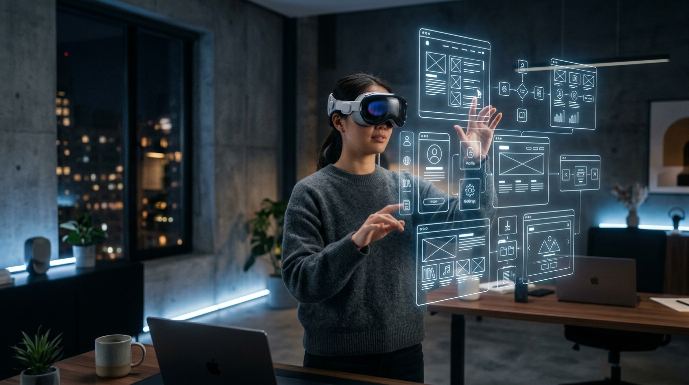
The most common mistake design teams make when approaching spatial computing is treating the Apple Vision Pro as a very large curved monitor. It is not. A monitor is a surface you look at. A spatial computing environment is a space you inhabit. Every 2D UX convention — fixed layouts, z-index stacking, hover states, pixel-grid precision — either translates poorly or does not translate at all. The teams producing the highest-quality visionOS experiences in 2026 started by unlearning before they started building.

As BuiltUX has examined across strategic analyses of spatial micro-interactions and tactile depth design, ambient UX and attention-aware interface design, and generative UI and dynamic interface architectures, spatial computing represents the most significant shift in interaction paradigm since the smartphone eliminated the physical keyboard. The design principles that govern it are not extensions of existing UX frameworks — they are a parallel discipline.

1. The Five Core Spatial UX Principles for visionOS (2026)

Principle 1 — Windows Are Not Screens; They Are Objects: In visionOS, a window is a physical object that exists in a user’s real environment. It has depth, cast shadows, and responds to real-world lighting. Design for the window as a three-dimensional object — not a flat portal. This means: avoid full-screen takeovers, respect the user’s real-world context (they can see their room around your interface), and design windows at a scale and depth that feels natural at typical arm’s-length interaction distance (approximately 1.5–2.5 metres).

Principle 2 — Eye + Hand Tracking Is Not a Mouse: visionOS’s primary input model — look to select, pinch to activate — is fundamentally different from pointer-based interaction. Design implications: minimum interactive target size is 44×44 points (enforced by HIG), interactive elements must have clear visual hover states triggered by gaze focus (a subtle specular highlight, not a cursor), and avoid placing multiple interactive elements within 60 points of each other to prevent inadvertent selection.

Principle 3 — Depth Is a Layout Dimension: Spatial interfaces have a Z-axis that 2D design ignores. Use depth intentionally: primary content at 0 (the window plane), secondary controls slightly recessed at -10 to -30 points, interactive objects that need to feel physical and grabable at +10 to +40 points forward. Apple’s Materials system handles most of the rendering — design in terms of semantic depth layers, not raw Z-values.

Principle 4 — Typography at Distance Requires Recalibration: At 2 metres reading distance in a spatial environment, the effective DPI of the display is significantly different from a desktop monitor at 60cm. San Francisco Display (the visionOS system typeface) renders at optical sizes of 34pt+ as a minimum for body text — translating to approximately 17px equivalent at standard desktop reading distance. Never use font sizes below 22pt in spatial interfaces; 28–34pt is the practical body text floor.

Principle 5 — Ornaments, Not Notifications: visionOS’s attention model is fundamentally different from mobile. Push notifications, modal interruptions, and attention-demanding alerts are deeply disruptive in a spatial environment where the user’s physical reality is always present. Design for ambient awareness — spatial audio cues, peripheral motion in the window chrome, gentle material state changes — rather than modal interruption patterns imported from mobile.

visionOS vs. iOS vs. Web: Key UX Design Parameter Differences (2026)

Design Parameter Web / Desktop iOS / Mobile visionOS / Spatial
Min Interactive Target24×24px (WCAG)44×44pt (HIG)60×60pt minimum (gaze tolerance)
Min Body Text Size16px17pt28–34pt (2m reading distance)
Primary Input ParadigmMouse / keyboardTouch (single-handed preferred)Eye gaze + pinch gesture
Layout AxesX, Y (+ CSS Z for stacking)X, YX, Y, Z (semantic depth layers)
Notification ModelBanner / modalPush notification / modalSpatial audio ornaments (ambient)
Rupert Tait’s Strategic Verdict: Spatial computing is not a design challenge for teams that master the HIG parameters and SwiftUI layout primitives. It is a design challenge for teams willing to rethink what an interface is for. The teams building the highest-quality visionOS experiences in 2026 share one trait: they spent the first third of their project timeline in research and concept validation, not wireframing. The paradigm is new enough that the most dangerous asset a spatial design team can have is an experienced 2D UX designer who is confident they already understand the interaction model. They don’t. Neither did anyone else, until recently.

People Also Ask

How do you design UX for Apple Vision Pro?
Design for gaze-based input (minimum 60×60pt interactive targets), semantic depth layers (content at 0, controls recessed, interactive objects forward), body text at 28–34pt minimum for 2-metre reading distance, and ambient notification patterns instead of modal interruptions.

What is the difference between spatial computing UX and regular UX?
Spatial computing replaces the flat 2D screen surface with a three-dimensional space the user inhabits. Interaction shifts from mouse/touch to eye gaze and pinch gestures. Layout gains a Z-axis. Typography scales change with viewing distance. Notification models must avoid interrupting the user’s physical reality.

Is Apple Vision Pro good for enterprise UX?
Yes, for specific use cases: spatial data visualization, 3D product configuration, multi-window productivity environments, and training simulations. Enterprise visionOS development is accelerating in 2026, with Apple expanding Enterprise Distribution options and SwiftUI adding spatial layout primitives.