
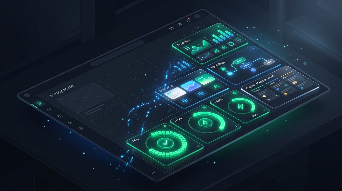
In product design, there is a critical moment during every user’s first session known as the “Blank Slate Dilemma.” A prospect signs up for an analytics tool, a project management workspace, or an API dashboard, completes registration, and is greeted by a desolate grey screen with the text: “No items found. Click + to create a project.” In product-led growth (PLG) economics, generic empty states cause over 50% of trial users to abandon the software within 90 seconds. In 2026, category leaders (Linear, Loom, Notion, Canva) treat empty states not as passive error placeholders, but as **high-converting interactive launchpads** that drive user activation rates above 40%.
- The ‘Pre-Populated Sandbox’ Pattern: Inject 3 to 5 sample data records (marked with a subtle ‘Demo’ badge) so users can immediately test sorting, filtering, and detail views without typing.
- The 1-Click Starter Template: Replace the solitary “+ Create” button with 3 distinct outcome-based templates (e.g. “Sprint Planning”, “Bug Tracking”, “Product Roadmap”).
- The Educational Micro-Video: Embed an auto-looping 6-second silent micro-interaction GIF demonstrating exactly what the populated workspace will look like in production.
The 5 High-Converting Empty State Archetypes
| Empty State Type | Legacy Anti-Pattern (Zero Intent) | PLG High-Converting Solution |
|---|---|---|
| 1. First-Time Setup (Day 0) | Blank table with empty headers | Interactive 3-step checklist + Instant Sample Data button |
| 2. Zero Search / Filter Match | “0 results for ‘keyword'” | Fuzzy search suggestions + 1-click “Clear all filters” button |
| 3. Feature Gate / Paywall | Locked icon + “Upgrade to Pro” modal | Interactive sandbox preview showing output with “Try 1 Free” trigger |
| 4. Cleared / Completed State | Disorienting blank inbox | Celebratory illustration (Inbox Zero) + Next suggested workflow |
Designing the “Zero Friction” Call-to-Action
Every effective empty state must answer three psychological questions for the user in under 3 seconds:
- Where am I? (Clear, concise title explaining the workspace purpose).
- Why is it empty? (Reassure the user that nothing is broken).
- What do I do next? (A single, unambiguous primary CTA button that generates immediate value).
Combine empty state UX with our teardowns on B2B SaaS Onboarding Architecture and The Anti-Churn UX Blueprint.
Frequently Asked Questions: SaaS Empty State UX
Should empty states include heavy illustrations?
No. Complex decorative illustrations create visual noise without conveying utility. Modern SaaS design favors subtle, abstract UI wireframe sketches paired with clear action buttons and starter templates.
How does sample demo data improve trial conversion?
Populating an empty workspace with editable sample records allows users to experience the “Aha!” moment of filtering, editing, and sharing immediately, reducing time-to-value (TTV) from 15 minutes down to 30 seconds.
How should mobile apps handle empty states differently from desktop?
On mobile screens, eliminate lengthy explanatory copy and place the primary action button within the natural bottom-thumb reach zone, accompanied by a quick native action sheet.
An empty state is never a blank screen; it is the critical onboarding fork in the road between a churned prospect and an activated, paying power user. By transforming zero-data screens into structured starter templates and sandbox environments, product designers turn passive drop-off points into self-serve conversion engines.