
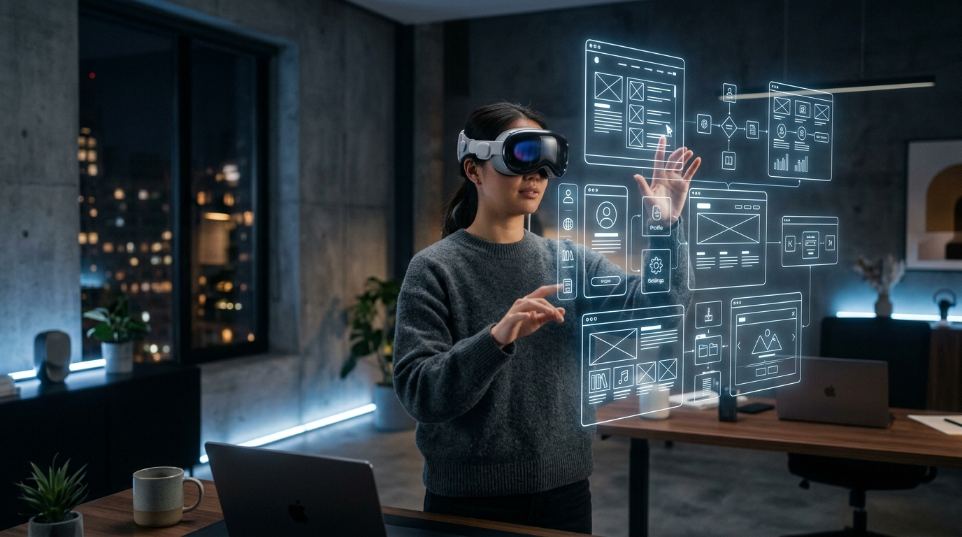
The most common mistake design teams make when approaching spatial computing is treating the Apple Vision Pro as a very large curved monitor. It is not. A monitor is a surface you look at. A spatial computing environment is a space you inhabit. Every 2D UX convention — fixed layouts, z-index stacking, hover states, pixel-grid precision — either translates poorly or does not translate at all. The teams producing the highest-quality visionOS experiences in 2026 started by unlearning before they started building.
What Are the Core UX Principles for Designing Spatial Computing Interfaces on Apple Vision Pro?
Executive Design Strategy & Direct Answer:
Spatial computing replaces physical screen borders with infinite volumetric canvas space governed by eye tracking, subtle finger pinches, and depth displacement. Designers must implement minimum 60pt interactive target hitboxes, utilize dynamic glass materials that blend with ambient real-world room lighting, and anchor interfaces within a comfortable 1.5 to 2.0 meter field of view to prevent eye strain.
Designing for visionOS requires a fundamental shift from screen real estate management to human ergonomic physiology.
| Design Dimension | 2D Screen Paradigm (Web/Mobile) | Spatial visionOS Paradigm (2026) | Human Factor Consideration |
|---|---|---|---|
| Target Hitbox Size | 24px – 44px touch targets | Minimum 60pt spatial hitboxes | Accounts for natural eye saccade jitter |
| Background Surfaces | Opaque hex colors & CSS gradients | Dynamic system glass material | Adapts to real-world room lighting & colors |
| Z-Axis Stacking | CSS z-index artificial layering |
True physical millimeter depth displacement | Establishes natural visual priority |
| Input Trigger | Mouse click / physical screen tap | Eye look + subtle finger pinch gesture | Zero physical arm fatigue |
Why Eye Tracking Requires Generous Target Sizes
Physiological Eye Saccades:
The human eye never stays completely stationary; it produces micro-saccades (rapid involuntary eye movements) even when fixating on an object. In spatial computing, interfaces that use dense 24px web buttons cause extreme frustration, as the eye-tracking system misinterprets micro-saccades as intent to click adjacent items. All interactive spatial elements must have generous padding and minimum 60pt active zones.
Related Interaction Design: Explore how tactile haptics complement spatial interfaces in Spatial Micro-Interactions & Haptic UX, and examine cross-device scaling in Multi-Surface Brand Systems.
Principal Analyst’s Verdict:
Spatial computing is not a novelty; it is the next major computational platform. The teams building the future of software in visionOS recognize that comfort, restraint, and deep biological respect for human vision are the true differentiators of luxury digital craft.