
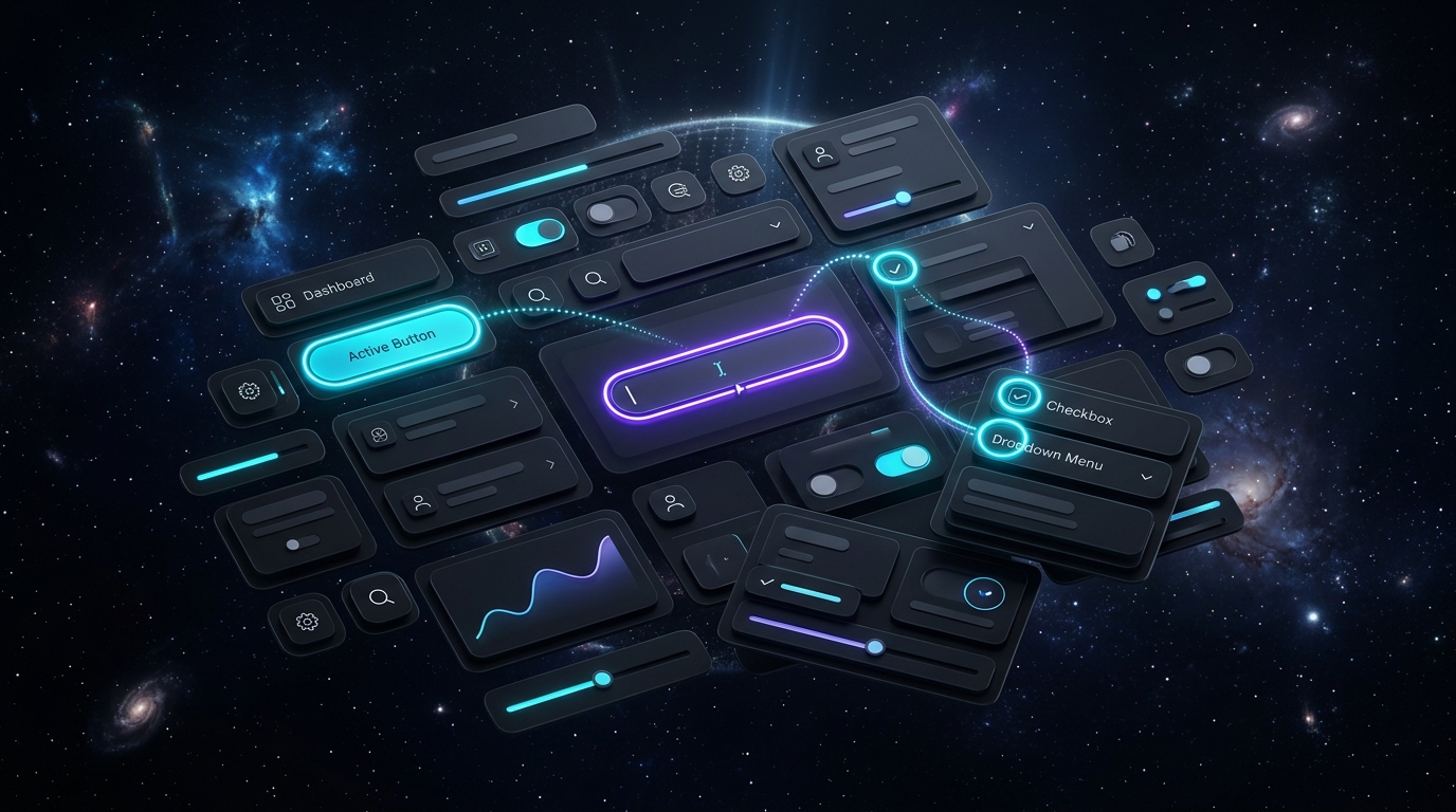
For years, a pervasive anti-pattern infected product design: developers and designers stripping away default browser outlines using outline: none because they deemed the blue ring unsightly on mouse clicks. In doing so, they rendered digital applications completely unusable for millions of power keyboard navigators, motor-impaired users, and assistive technology operators. With the mandatory enforcement of WCAG 2.2 Success Criterion 2.4.11 (Focus Appearance), designing visible, high-contrast, and aesthetic focus states is no longer optional. In 2026, leading design systems utilize the :focus-visible pseudo-class, multi-layer offset box shadows, and 3:1 luminance contrast boundaries to deliver world-class keyboard ergonomics without visual clutter.
- Never Remove
:focusWithout:focus-visible: The:focus-visibleselector only displays focus indicators when the user navigates via keyboard (Tab key) or assistive hardware, remaining invisible during mouse clicks. - The 2px Offset Rule: Direct adjacent focus rings blur into component borders. Applying
outline-offset: 2pxcreates an optical air gap that dramatically improves indicator visibility across light and dark modes. - The Double-Ring Inversion Technique: On complex patterned or variable dark backgrounds, a single colored ring may fail contrast. A double-layer shadow (white inner ring + dark outer ring) guarantees 100% WCAG contrast parity everywhere.
WCAG 2.2 Focus Ring Compliance Requirements
| Accessibility Metric | WCAG 2.2 AA Standard | Recommended Design System Implementation |
|---|---|---|
| Minimum Contrast Ratio | 3:1 contrast against adjacent colors | 4.5:1+ using dedicated token (e.g. var(--focus-ring)) |
| Minimum Indicator Area | Solid 2px perimeter around component | outline: 2px solid; outline-offset: 2px; |
| Sub-Component Visibility | Focus must not be fully obscured by sticky headers | scroll-padding-top: 80px; on root HTML container |
The Modern CSS Multi-Layer Focus Pattern
Modern design systems (such as Radix UI, Tailwind CSS, and Linear) define focus tokens as layered box shadows rather than rigid browser outlines, allowing focus rings to gracefully respect rounded border radiuses:
/* Universal accessible focus token with optical gap */
:focus-visible {
  outline: none;
  box-shadow:
    0 0 0 2px var(--bg-surface),     /* 2px background mask gap */
    0 0 0 4px var(--color-brand-500); /* 2px crisp focus indicator */
}
Pair keyboard accessibility with our guides on Micro-Typography & Visual Hierarchy and Linear’s Keyboard-First UX Secrets.
Frequently Asked Questions: Focus States & Keyboard UX
What is the difference between :focus and :focus-visible?
`:focus` triggers on ANY interaction (mouse click, touch tap, or keyboard Tab). `:focus-visible` intelligently triggers ONLY when the browser detects keyboard navigation or assistive device input, keeping mouse clicks clean while preserving 100% accessibility.
Why do standard CSS outlines look distorted on pill-shaped buttons?
Older CSS `outline` implementations did not respect `border-radius`, creating square boxes around round buttons. Modern browsers support rounded outlines, or design teams can use `box-shadow` rings that strictly match component curvature.
Can custom focus rings trigger legal compliance penalties?
Yes. Under the European Accessibility Act (EAA) and US ADA Title II digital guidelines, websites with removed or low-contrast focus indicators face severe legal compliance audits and enterprise contract disqualifications.
Focus states are the fundamental GPS of keyboard navigation. By moving beyond naive `outline: none` hacks to calibrated `:focus-visible` offset rings, design systems achieve complete legal compliance while elevating the speed, precision, and tactile polish of the entire product.