
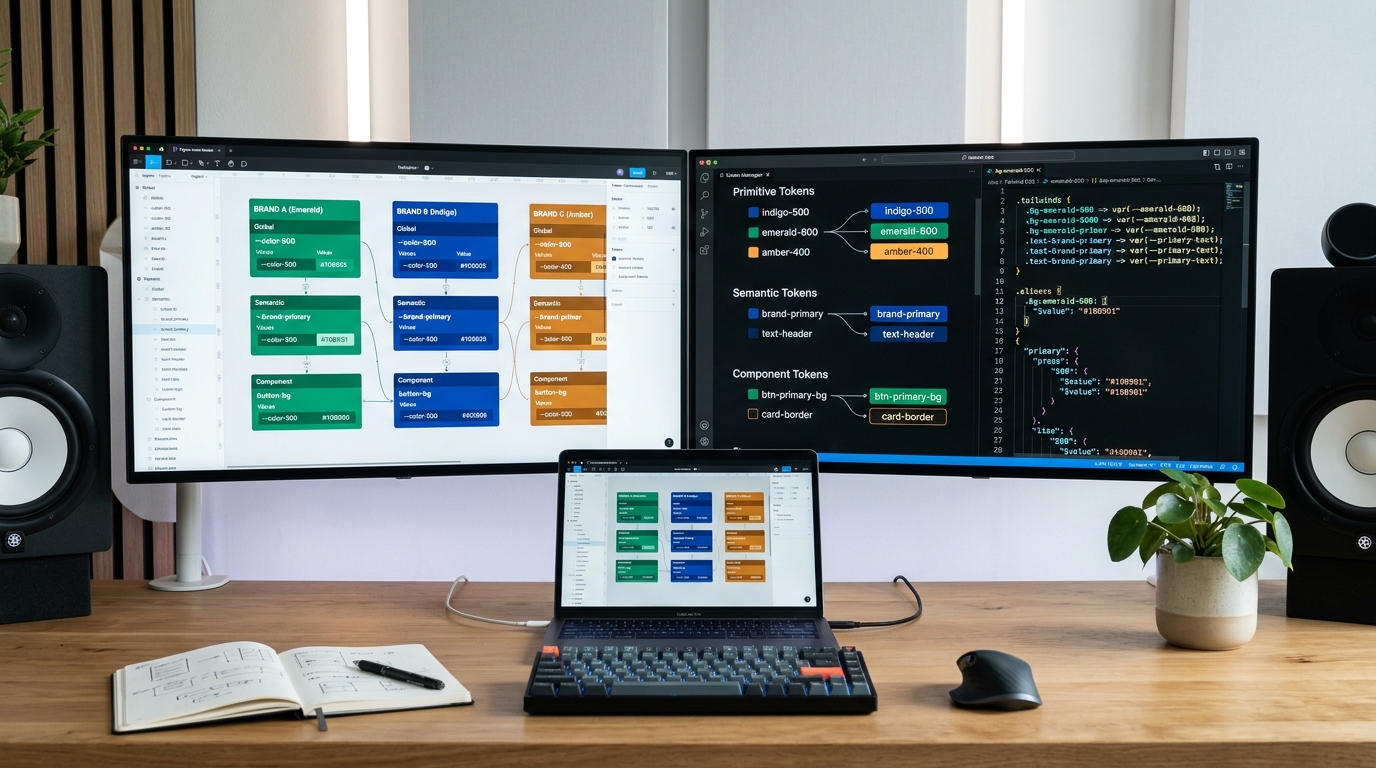
For enterprise product organizations managing white-labeled software suites, holding company portfolios, or multi-tenant platforms, design consistency represents a multi-million-dollar challenge. When five distinct brand subsidiaries share a single component codebase, hardcoded design decisions cause immediate architectural collapse. In 2026, scaling design systems across multiple brands requires implementing a strict 3-tier design token architecture that cleanly decouples primitive brand values from semantic intent and component execution.
How Do Enterprise Design Systems Manage Multi-Brand Semantic Tokens and Dark Mode?
1. The 3-Tier Design Token Hierarchy: Primitive, Semantic, and Component
The fundamental mistake enterprise teams make when adopting tokens is linking UI components directly to raw color palettes (e.g., referencing color-emerald-500 inside a button style). To support multi-brand white-labeling and seamless dark mode toggles, tokens must be structured across three isolated layers:
- Tier 1: Global Primitive Tokens: Raw, context-agnostic visual values (e.g.,
color-emerald-500: #10b981,font-size-16: 1rem,space-4: 16px). These describe what exists in the palette, with zero business logic attached. - Tier 2: Semantic Alias Tokens: Contextual tokens that assign functional meaning to primitives (e.g.,
color-surface-brand-primary,color-text-interactive-hover,border-radius-container-card). This is the switching layer where different brand modes and dark/light themes are defined. - Tier 3: Component-Scoped Tokens: Highly specific tokens applied strictly to individual component properties (e.g.,
button-primary-bg-default,table-row-border-hover). These inherit directly from Semantic Aliases.
2. Managing Figma Variables to Code Parity
When syncing tokens between design and code, organizations frequently face synchronization drift. By mastering design token pipelines between Figma Variables and Tailwind CSS, teams establish automated continuous integration pipelines via Style Dictionary and GitHub Actions.
Furthermore, when crafting multi-brand themes, maintaining accessibility is paramount. As explored in our deep-dive on dark mode color architecture and contrast ratios, semantic surface elevation tokens (surface-0, surface-100, surface-200) must calculate perceptual lightness using APCA (Accessible Perceptual Contrast Algorithm) rather than simple linear alpha blending.
3. Automated Design Linting in CI/CD Pull Requests
The greatest threat to a multi-brand token system is rogue developer styling (e.g., hardcoding background-color: #3b82f6 in a React component). Modern enterprise teams deploy custom ESLint and Stylelint plugins that reject any CSS/JSX commit containing raw hex, rgb, or pixel values not mapped to the token namespace.
People Also Ask
What is the difference between global and semantic design tokens?
Global (primitive) tokens define raw design values such as specific color hexes or pixel sizes without context. Semantic tokens assign functional intent to those values (e.g., naming a color ‘surface-brand-primary’ or ‘text-danger’) so that themes and dark modes can change without rewriting component styles.
How do design tokens enable white-labeling in SaaS?
Design tokens allow a single React or web component codebase to render completely different visual identities (colors, typography, corner radii, spacing) simply by swapping the semantic token stylesheet or dataset attributes at runtime.
What tools are used to sync Figma Variables to production code?
Enterprise teams use Style Dictionary, Tokens Studio, and automated GitHub Action webhooks to transform Figma Variables into CSS Custom Properties, SCSS variables, iOS Swift, and Android XML tokens automatically upon publishing.