
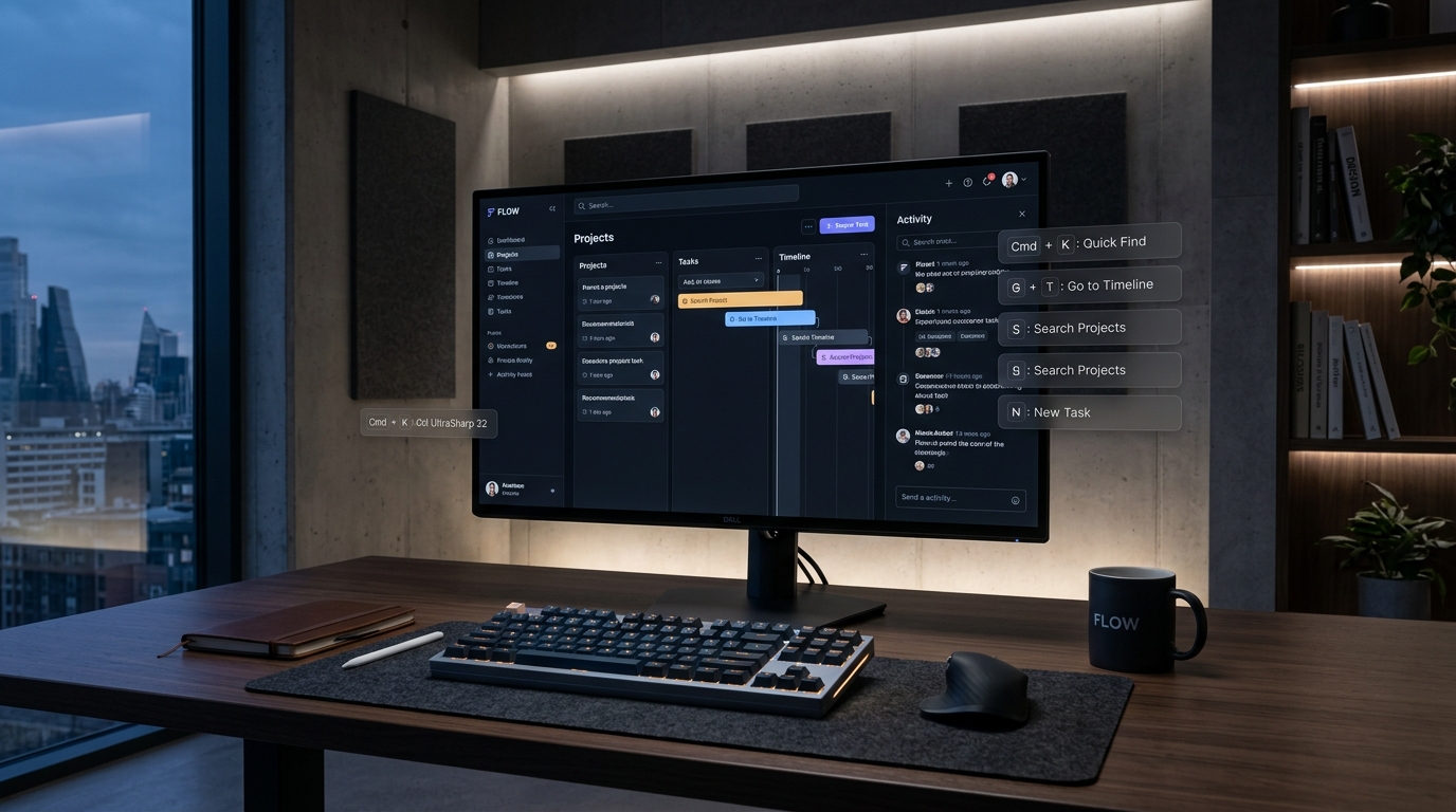
- The Fitts’s Law Cliff: Mouse pointing across high-resolution displays consumes 800ms to 1,400ms per action. Two-key modal sequences reduce cognitive execution to sub-120ms.
- Spatial Key Chords: Moving beyond single modifiers toward modal sequence states (e.g.,
GthenIfor Inbox,Cfor Create) to eliminate shortcut collision. - Focus Preservation: Maintaining strict DOM focus traps and non-destructive virtual selection buffers across client-side state trees.
- Progressive Discoverability: Inline keyboard shortcut badges rendered dynamically based on user engagement frequency.
In modern B2B SaaS, speed is no longer an invisible technical optimization—it is the primary product differentiator. When high-velocity software teams choose tools like Linear, Superhuman, and Raycast over legacy incumbents like Jira or Salesforce, they are not selecting features; they are purchasing cognitive flow. Reaching for a mouse breaks mental immersion. Keyboard-first navigation preserves it.
Engineering a truly fluid keyboard UX requires far more than binding a few keydown event listeners to a React hook. It demands a dedicated spatial state machine, an optimistic rendering layer, and an accessible focus architecture that prevents focus drift during dynamic DOM mutations.
1. The Chording Architecture: Two-Key Modal Sequences
Most SaaS applications saturate common single-key combinations (such as Cmd+C, Cmd+V, and Cmd+S). When products attempt to cram every feature into modifier-heavy combinations (e.g., Cmd+Alt+Shift+P), physical finger gymnastics cause cognitive friction.
Linear and Superhuman bypass this through key sequences (chords). Inspired by Vim and Emacs, hitting a lead key transitions the application into a temporary listening mode for 400 milliseconds:
TypeScript: Chording Sequence Listener Hook
// Hook managing two-step keyboard chords (e.g., G then I -> Go to Inbox)
export function useKeyChord(leadKey: string, followKey: string, onExecute: () => void) {
  const [awaitingFollow, setAwaitingFollow] = useState(false);
  const timeoutRef = useRef<NodeJS.Timeout | null>(null);

  useEffect(() => {
    const handleKeyDown = (e: KeyboardEvent) => {
      // Ignore when focused inside text inputs
      if (['INPUT', 'TEXTAREA'].includes((e.target as HTMLElement).tagName)) return;

      if (!awaitingFollow && e.key.toLowerCase() === leadKey.toLowerCase()) {
        setAwaitingFollow(true);
        timeoutRef.current = setTimeout(() => setAwaitingFollow(false), 450);
        return;
      }

      if (awaitingFollow && e.key.toLowerCase() === followKey.toLowerCase()) {
        e.preventDefault();
        if (timeoutRef.current) clearTimeout(timeoutRef.current);
        setAwaitingFollow(false);
        onExecute();
      }
    };

    window.addEventListener('keydown', handleKeyDown);
    return () => window.removeEventListener('keydown', handleKeyDown);
  }, [awaitingFollow, leadKey, followKey, onExecute]);
}
This chording pattern unlocks an infinite namespace of intuitive, memorable actions without conflicting with operating system or browser native shortcuts. Pair this with our teardown of Raycast’s command bar navigation to build an unstoppable productivity suite.
2. Spatial Navigation vs. DOM Tab Order
Standard browser Tab navigation follows linear DOM order from top-left to bottom-right. In an enterprise dashboard containing complex nested data tables, multi-column kanban boards, and inspector sidebars, pressing Tab 45 times to reach an issue card is completely unusable.
High-end power user interfaces implement Spatial 2D Arrow Navigation. By tracking active grid coordinates (x, y) in client state, pressing the arrow keys moves selection directly across columns and rows regardless of HTML nesting:
| Navigation Pattern | Legacy Web UX | Power User UX (Linear / Raycast) |
|---|---|---|
| Focus Control | Native Tab loop (Linear DOM traversal) | Spatial 2D Grid Coordinates (J/K or Arrows) |
| Action Invocation | Context menu clicks via mouse | Instant Action Sheet (Cmd+K or Spacebar) |
| Visual Focus Ring | Browser default blue halo or hidden outlines | Custom 2px dual-offset high-contrast rings |
| Execution Latency | 950ms – 1,800ms | < 90ms |
To ensure keyboard navigation meets accessibility compliance, always implement our guidelines on accessible focus rings and keyboard navigation states to satisfy WCAG 2.2 Success Criterion 2.4.13.
3. Optimistic UI & Focus Preservation
When a power user triggers an action—such as archiving a task with E or toggling priority with P—the interface cannot wait for a round-trip network response before updating visual focus. Doing so introduces an 80ms stutter that breaks flow.
The state machine must execute an optimistic transition: immediately advance the active row cursor to index i + 1, visually fade out the completed card, and fire the background mutation. For deep architectural guidance on local-first state, examine our deep dive on why Linear feels instant with optimistic UI and local-first architecture.
Frequently Asked Questions: Keyboard UX Architecture
How do you prevent keyboard shortcuts from firing when users type in input fields?
Check e.target.tagName in your global keydown listener. If the target is an INPUT, TEXTAREA, or has contentEditable="true", early return and ignore single-key shortcuts, allowing native text entry to function normally.
What is the difference between keyboard shortcuts and key chords?
A keyboard shortcut typically requires pressing multiple keys simultaneously with a modifier (e.g., Cmd+Shift+P). A key chord involves pressing keys sequentially in a timed window without modifiers (e.g., pressing “G” then “D” to open a dashboard), significantly reducing ergonomic strain.
How do keyboard shortcuts impact user retention in SaaS?
Power users who adopt keyboard-first navigation exhibit 3x higher daily engagement and over 40% lower 90-day churn rates because the tool becomes embedded into physical muscle memory, creating massive switching costs.
Building sub-100ms keyboard UX is not an afterthought or an accessibility checkbox—it is a core product discipline that separates category-defining software from legacy enterprise bloat. By designing predictable two-key modal sequences, spatial 2D focus navigation, and optimistic client-side states, design teams transform passive software into an intuitive extension of the user’s hands.